Visual identity
Our logo
Ensuring consistency across all touchpoints.
Primary logo
The full-colour version should be used on all client-facing and internal communication. Use the landscape lockup by default, and the stacked version where the space is square or portrait.
Where colour is not an option, use the single-colour black or white versions rather than recolouring the logo yourself.
The primary logo
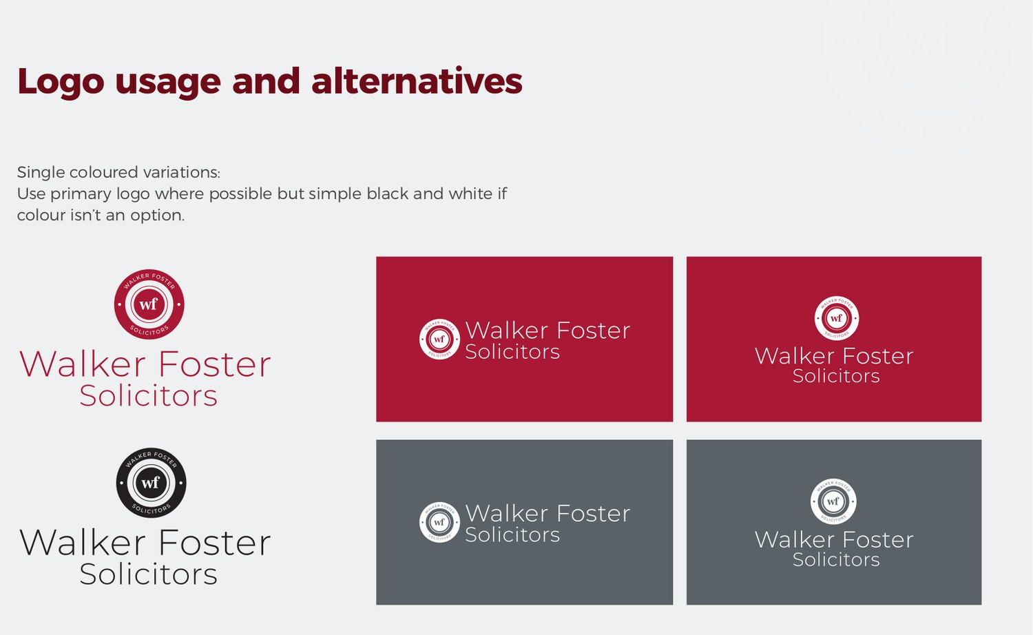
Single colour variations
Use the primary logo where possible, but simple black and white if colour is not an option.
Logo rules
Do
- Use the primary full-colour logo wherever colour is available
- Use black or white single-colour versions when colour is not an option
- Give the logo clear space on all sides
- Use the supplied files rather than recreating or redrawing it
Do not
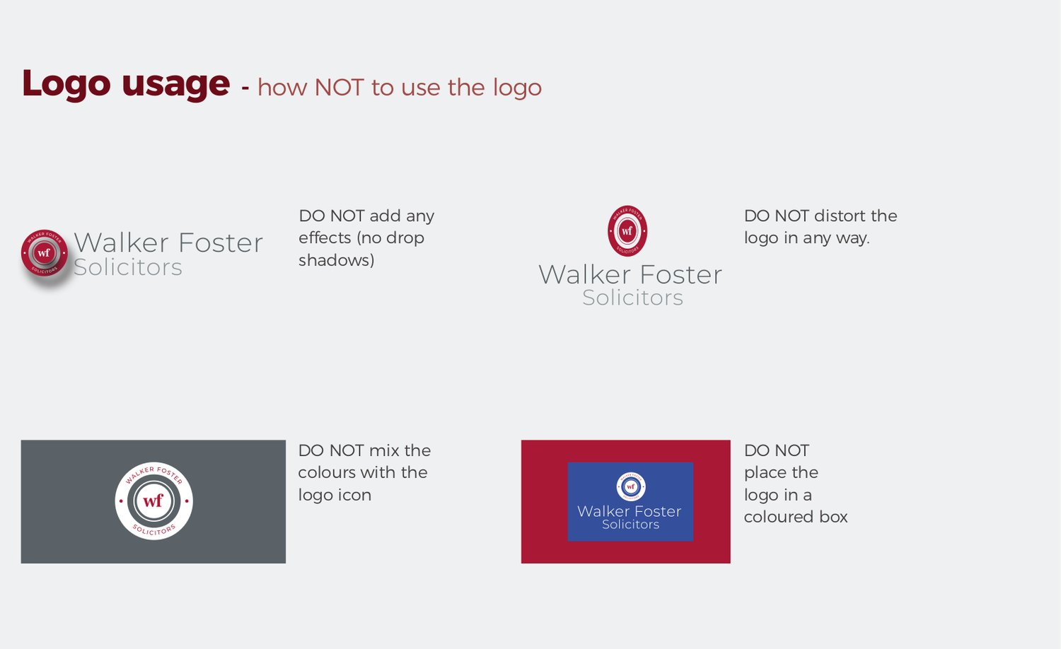
- Add effects such as drop shadows
- Distort or stretch the logo in any way
- Mix the colours within the logo icon
- Place the logo inside a coloured box
How not to use the logo
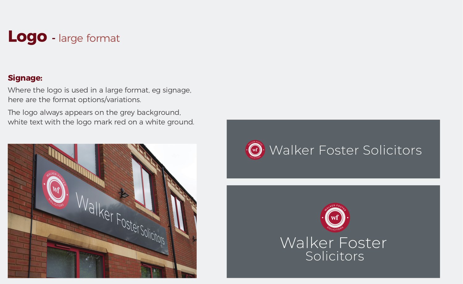
Large format and signage
Where the logo is used at large format, for example signage, it always appears on the grey background, with white text and the logo mark in red on a white ground.
Logo files
Every approved version, ready to use. Grab all formats at once, or a single file.

Landscape logo, full colour
Landscape logo, black

Landscape logo, white
Stacked logo, full colour
Stacked logo, black
Stacked logo, white