Imagery
Natural, not staged. Real people, real places.
Imagery style
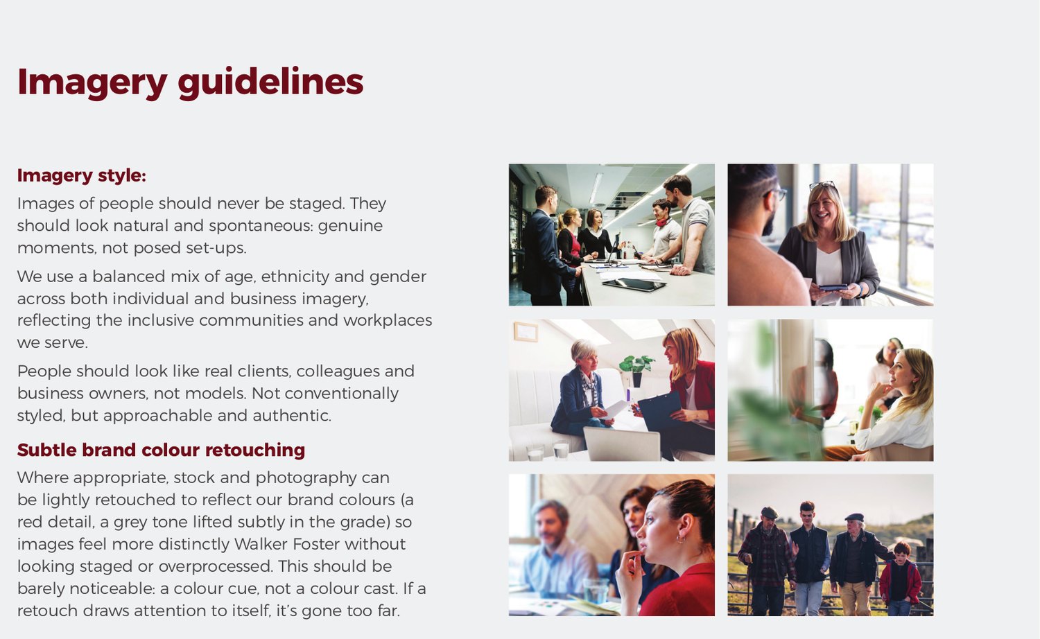
Images of people should never be staged. They should look natural and spontaneous: genuine moments, not posed set-ups.
We use a balanced mix of age, ethnicity and gender across both individual and business imagery, reflecting the inclusive communities and workplaces we serve.
People should look like real clients, colleagues and business owners, not models. Not conventionally styled, but approachable and authentic.
Subtle brand colour retouching
Where appropriate, stock and commissioned photography can be lightly retouched to reflect our brand colours: a red detail, a grey tone lifted subtly in the grade, so images feel more distinctly Walker Foster without looking staged or overprocessed. This should be barely noticeable: a colour cue, not a colour cast. If a retouch draws attention to itself, it has gone too far.
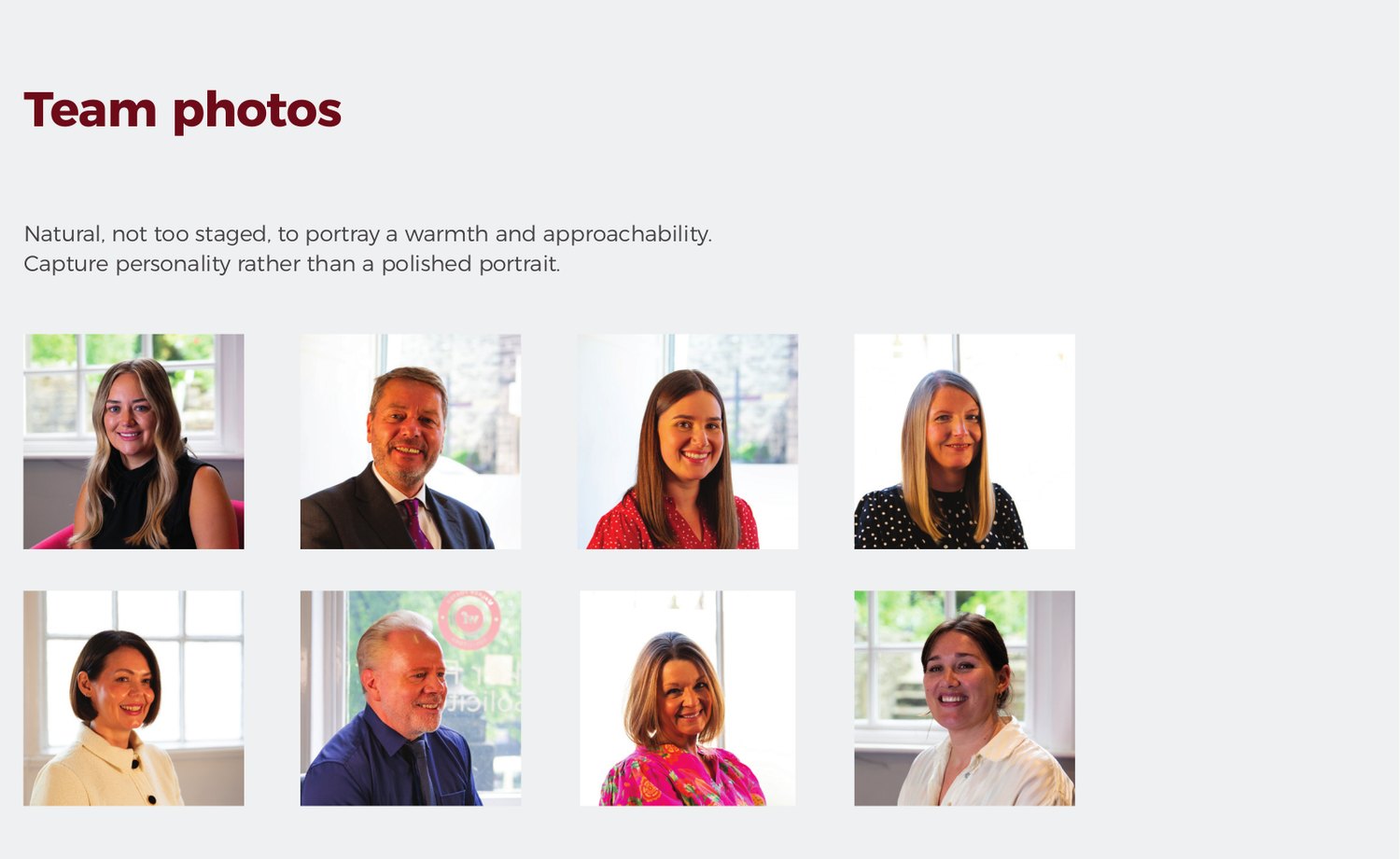
Team photos
Natural, not too staged, to portray warmth and approachability. Capture personality rather than a polished portrait.
Office & local presence
Alongside our service imagery, we use photography of our offices, local landmarks and people in these settings to reinforce our roots across Yorkshire and Lancashire. This imagery works across both individual and business content: it is less about who we are speaking to, and more about showing we are genuinely part of these communities.
Where possible, use images specific to each office (Skipton, Ilkley, Silsden, Barnoldswick, Settle, Northallerton and Harrogate) rather than one generic set, to support local search visibility for each location.
Office imagery and captions
| Shot | Caption |
|---|---|
| Office exterior | Local solicitors, here for you |
| Office interior or reception | A familiar face, close to home. |
| Local landmark with team or client in place | Rooted in the communities we serve. |
Graphic overlays
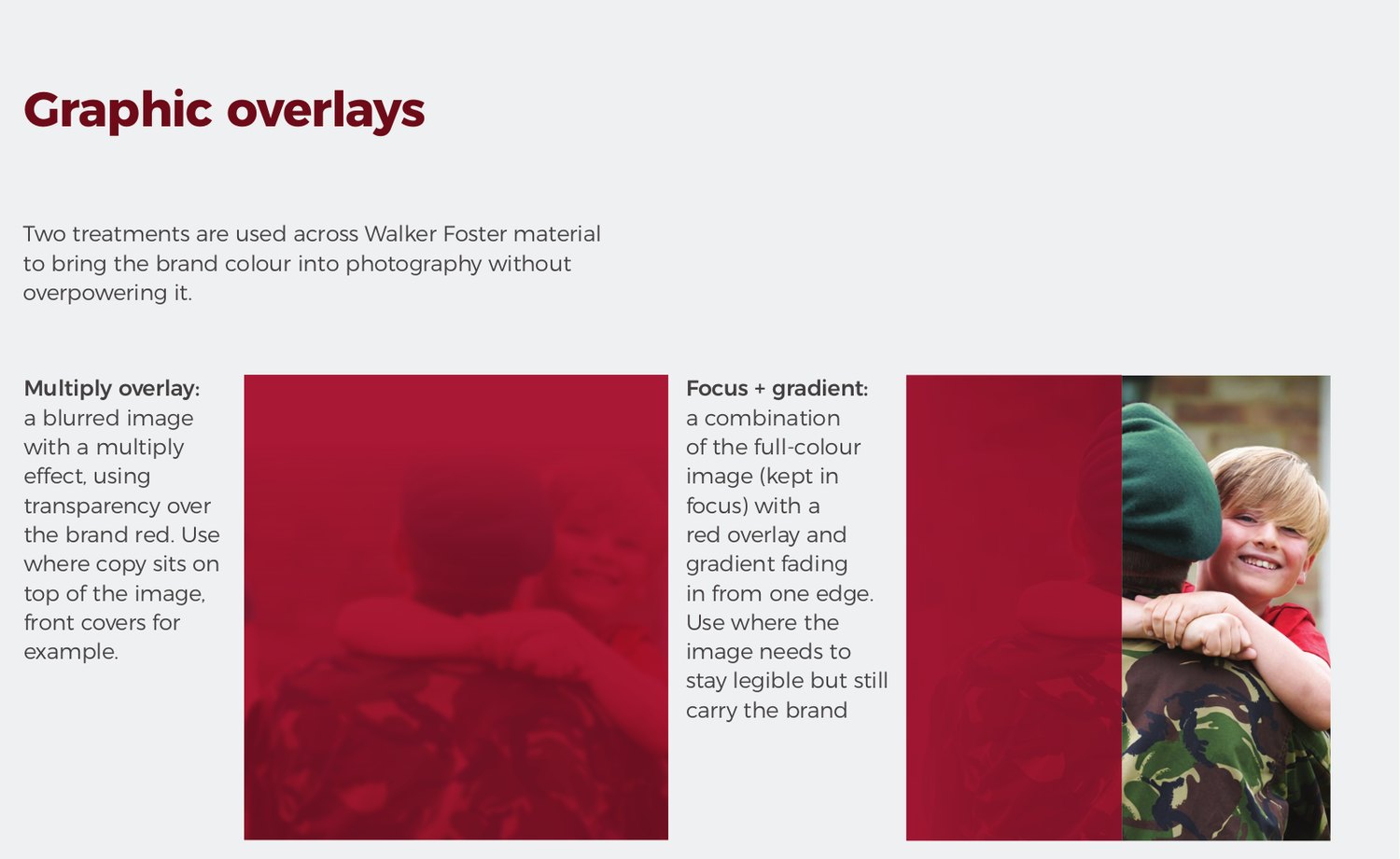
Multiply overlay
A blurred image with a multiply effect, using transparency over the brand red. Use where copy sits on top of the image, front covers for example.
Focus and gradient
The full-colour image kept in focus, with a red overlay and gradient fading in from one edge. Use where the image needs to stay legible but still carry the brand colour.