Visual identity

Colour & typography

The palette and type system that carry the brand across print and digital.

About the palette

The red symbolises power, determination and energy, conveying a bold, proactive and assertive approach to legal services.

Alongside it, the grey echoes professionalism, neutrality, stability and sophistication. As a blend of black and white it evokes balance, wisdom and logical, unbiased judgment, qualities highly valued in the legal profession.

Colour palette

#A6192E
Primary brand colour Pantone 187C · CMYK 22/100/78/16 Primary, and the Individuals sector colour
#6E0F22
Sub header colour Pantone 186C · CMYK 12/100/81/57 Sub headings
#63666A
Secondary brand colour Pantone Cool Grey 10C · CMYK 57/44/41/27 Secondary, and the Business sector colour
#97999B
Tertiary brand colour Pantone Cool Grey 7C · CMYK 42/30/28/8 Supporting tints and panels
#404040
Body copy colour CMYK 0/0/0/85 Body copy, print and digital

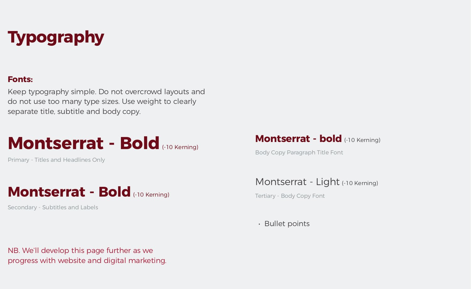
Typography

Keep typography simple. Do not overcrowd layouts and do not use too many type sizes. Use weight to clearly separate title, subtitle and body copy.

All weights are set with -10 kerning.

Aa
Montserrat Bold 'Montserrat', sans-serif · 700 Primary. Titles and headlines only
Aa
Montserrat Bold 'Montserrat', sans-serif · 600 Secondary. Subtitles, labels and paragraph titles
Aa
Montserrat Light 'Montserrat', sans-serif · 300 Tertiary. Body copy and bullet points
The type system as set out in the Brand Book.